In a context where local councils have to explain more information than ever, visual identity becomes an essential tool for organising, simplifying and bringing content closer to citizens. Current trends point towards more open, inclusive and flexible models of public communication, designed to build trust and improve the way residents receive information.
Current trends in municipal design: functionality, flexibility and accessibility
Municipal identities are evolving towards modular, flexible graphic systems. We are seeing brands that can adapt to campaigns, services, programmes, publications, signage and digital environments. The aim is to create a visual ecosystem that makes life easier for every department and projects a unified image of the administration as a whole.
Typography continues to gain ground as a functional element. Many councils opt for open-source typefaces that reduce costs, simplify roll-out and guarantee clear reading on screens and in print. This approach supports solid information hierarchies and a more accessible reading experience.
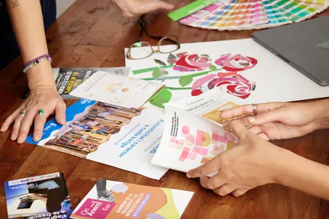
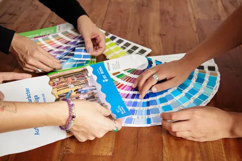
As for colour, palettes inspired by the local landscape are becoming the norm. Councils are choosing ranges that evoke scenery, heritage and local identity, with natural, balanced and well-contrasted tones. This approach strengthens the story of the town and makes it possible to develop coherent sub-identities for areas and services.
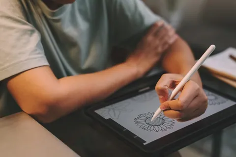
Iconography and illustration are becoming central resources in municipal communication. Simple, systematised icons designed to convey complex information quickly sit alongside illustrations that bring warmth and closeness. This visual language makes content easier to understand both on websites and in printed materials.
The use of data visualisation is also growing as a way of explaining budgets, projects, indicators and participatory processes. Clear infographics and charts reinforce transparency and make it easier to explain the impact of public policies.
Municipal photography is evolving towards more authentic, diverse and community-focused images. Priority goes to real scenes featuring people and everyday activities that convey closeness and reinforce the story of public service.
Municipal experience: local councils we have worked with
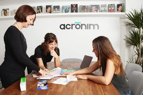
Working with a range of local councils has allowed us to see how these trends take shape in real projects and in very different needs. Each municipality brings its own challenges, but they all share the desire to communicate better and more coherently.
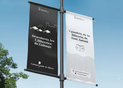
- Calonge i Sant Antoni – Strengthening visual coherence across campaigns and service information, particularly around tourism and community identity.
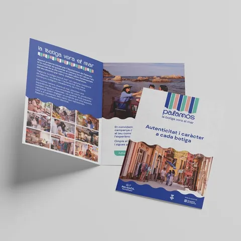
- Palamós – Communications rooted in the local area, balancing closeness with institutional solidity.
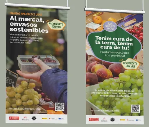
- Terrassa – Robust graphic systems that respond to the scale and complexity of a large city.
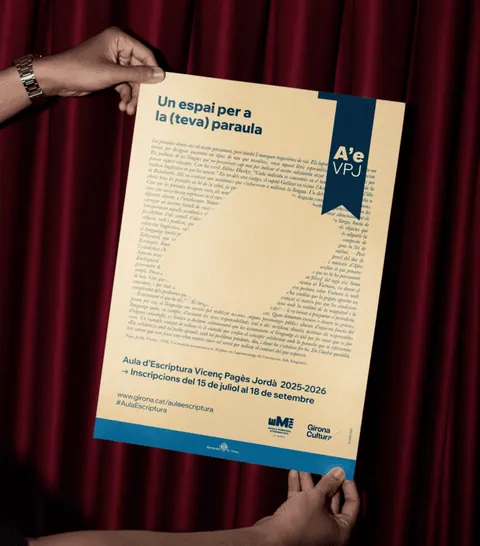
- Girona – Themed campaigns and participatory processes focused on visual clarity and adaptability.
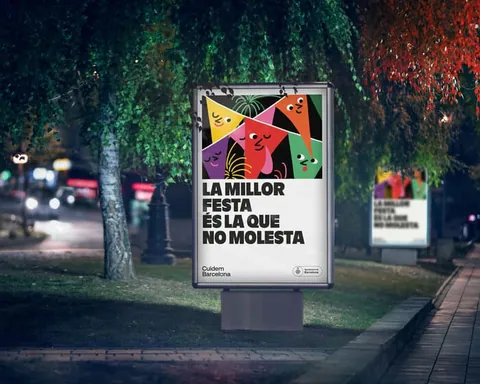
- Barcelona – Projects that call for modular identity systems, bespoke typefaces and complex brand architectures.
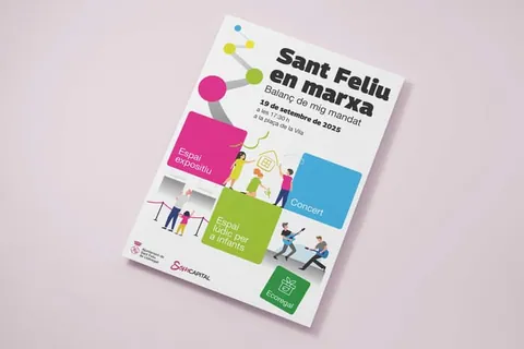
- Sant Feliu de Llobregat – Strengthening the city's story through social, cultural and community projects.
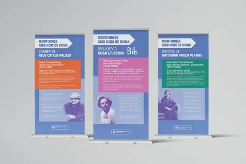
- Montornès del Vallès – Accessible, citizen-focused information materials.
In short, local authorities are adopting a new way of understanding graphic design: more functional, human and coherent. Current trends favour flexible systems and identities rooted in the local area, reinforced by accessibility, transparency and a closer, more representative image. Public design thus stops being purely a matter of aesthetics and becomes a key tool for explaining the work of local councils and strengthening the bond with citizens.