These days everything is on the move. Almost every area of our lives is constantly reinventing itself, above all the professional side and especially those creative professions that deal with the visual: fashion, architecture, advertising, graphic design… And it is the last of these that we will focus on in this article.
Design trends change and transform faster and faster and, although every brand has different needs, we have to stay at the forefront in order to use them to our advantage. The aim of any trend is to please consumers, since, in the end, they are the ones who create them: they decide what is on trend and what is not according to what they consume.
So it is very important to know them in order to design around what interests our audience and offer them what they want, catch their attention and earn their loyalty.
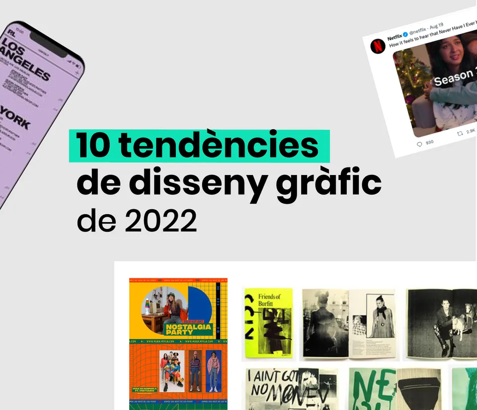
Because…there is nothing worse than a brand that is out of date! That is why we will take a tour of the graphic design sector and look at the 10 trends that have been most present this year, and which (who knows) may continue into the future:
1. The 90s and retro style
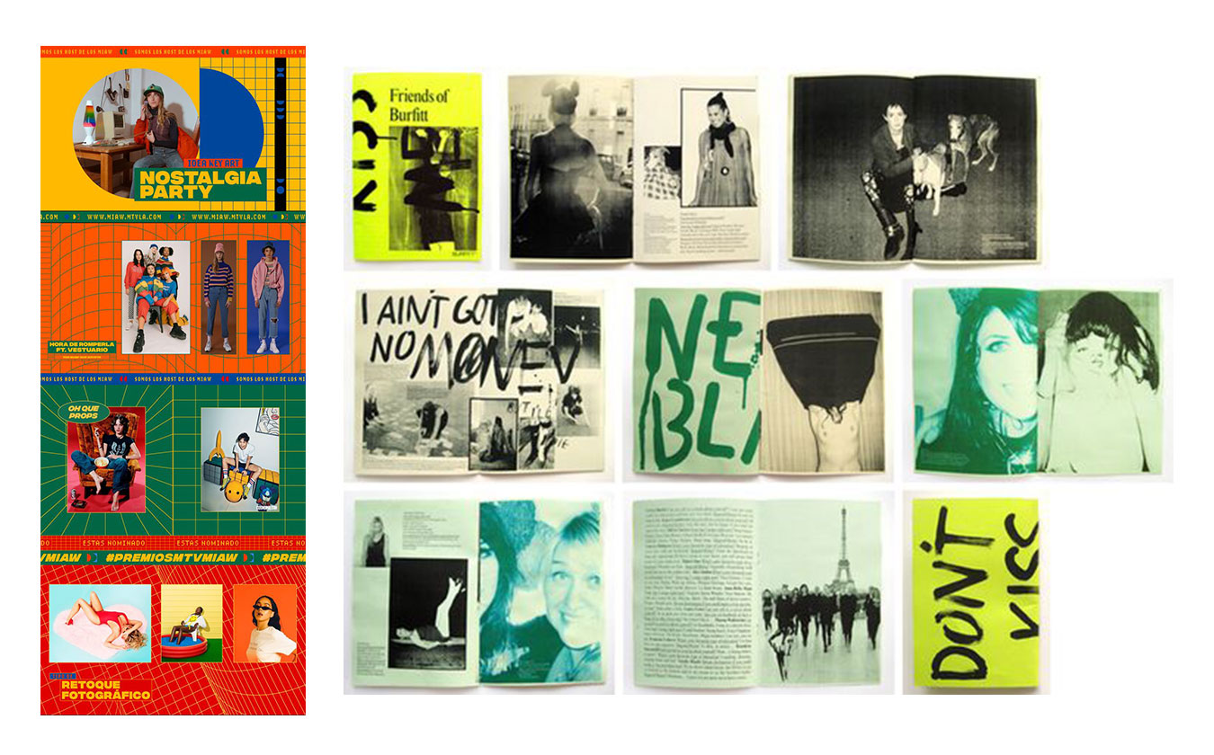
Retro style has never gone out of fashion, but this year it is booming more than ever and, as always, it keeps renewing itself. After the 70s and 80s revivals, now the 90s are back in force.
Nostalgia for the past and for the origins of the internet means that bright colours abound in digital design, along with very simple emoticons, pixelated images and, in short, everything that recalls the primitive design of the first websites. On the more editorial side, grunge style and urban art influences are resurfacing: rough textures, grainy or analogue-style images, collages, fanzine style, and so on.
This nostalgia marketing is a very powerful tool for connecting emotionally with consumers, especially the millennial audience.
2. Oversized titles and images
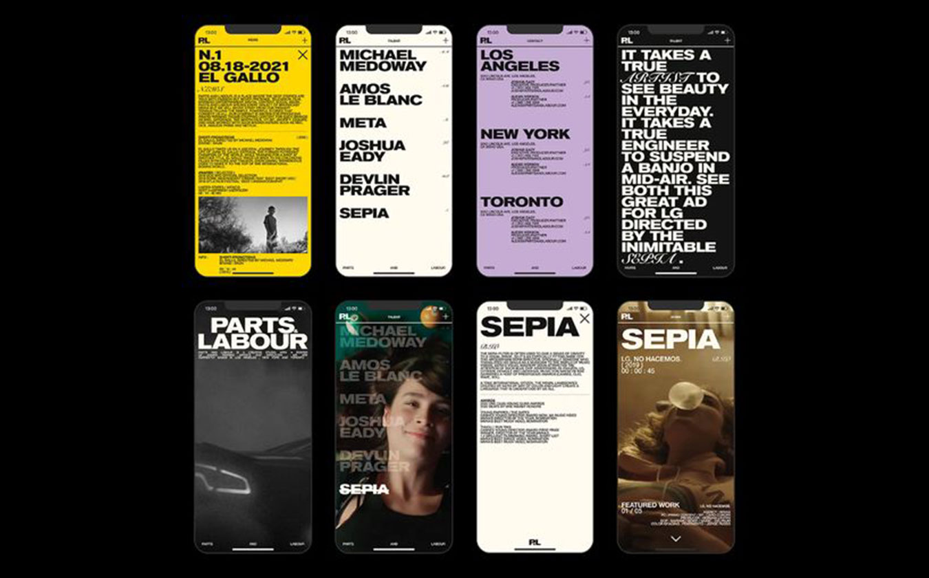
To grab attention very quickly and give weight to what we want. We make the image or the message stand out above everything else, always depending on what matters most in each case: if the message is key to our communication or typography is an essential part of the brand's personality, using very large text will be a good graphic solution. Lately, we tend to see this trend a lot on websites.
If, on the other hand, we want to focus attention on the product or we have very carefully crafted photography, we will use large images, as is common in the fashion world, among others.
That said, always balancing it with a good hierarchy among the rest of the elements.
3. Diversity
Representing the diversity we live in is in fashion, and we hope it never stops being so, or at least that is how it will always be at acrōnim! Using inclusive images in our communication that represent all audiences, genders, races and communities humanises brands and companies and makes them real. The world is diverse! And having respect and empathy for everything around us, more than a trend, is an obligation!
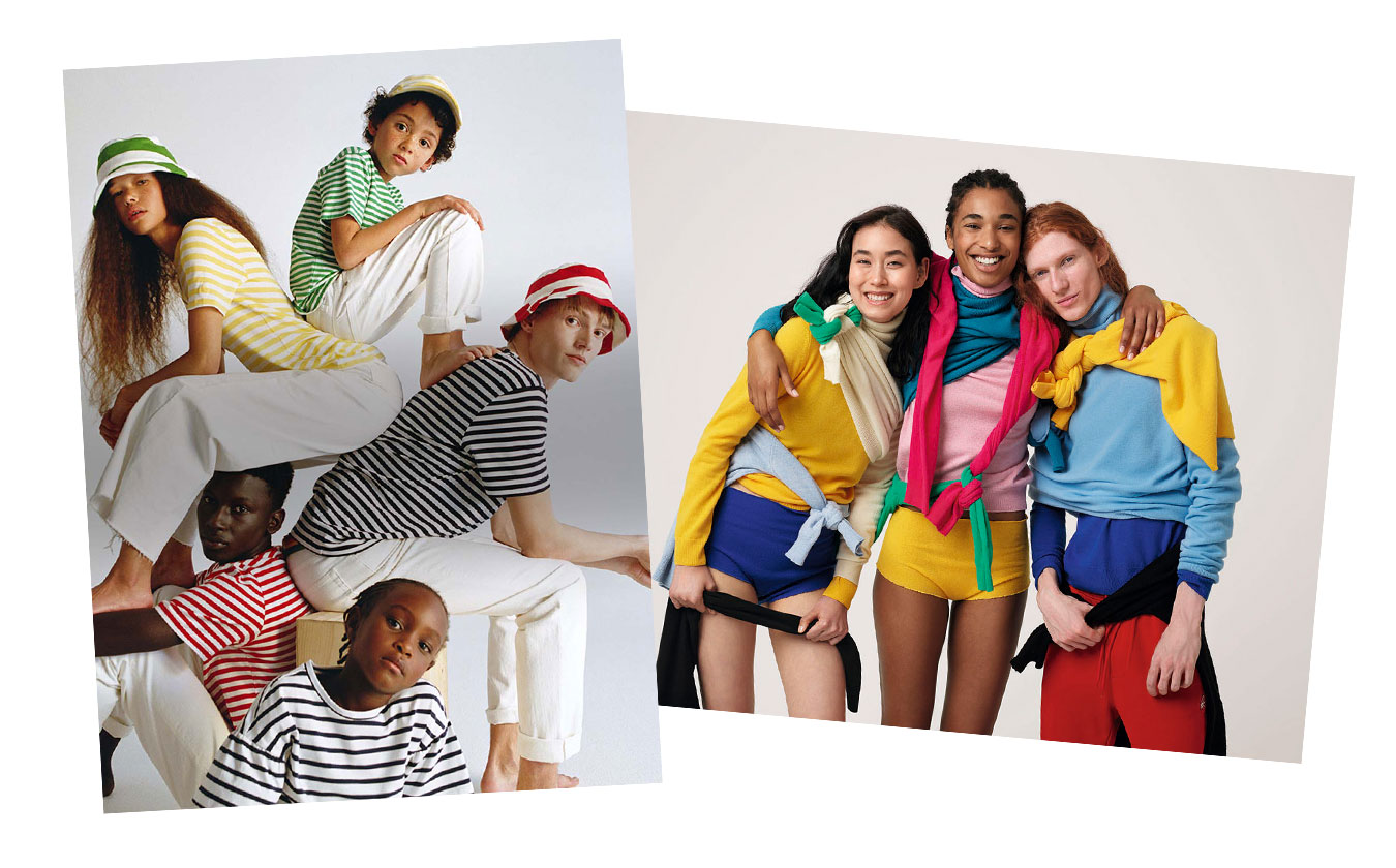
Images from various Benetton brand campaigns.
4. Short videos, gifs and looping animations
Combining graphic elements such as illustrations and typography, but in motion, catches our consumer's attention, helping the audience perceive our message in a more dynamic way and spend longer viewing it. What's more, the new social media algorithms are increasingly pushing us towards creating this kind of content.
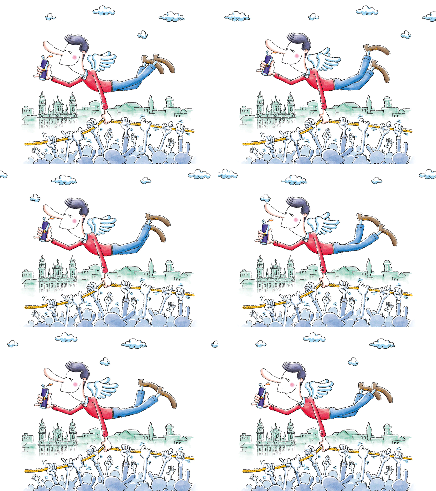
Image: Example of a gif from the Red Bull brand
5. Custom line illustrations
Simple, custom graphics can give any project a very interesting touch without losing professionalism. We are talking about line and/or hand-drawn illustrations, a trend we see more and more in campaigns.
They give communication a very honest, approachable feel, allowing us to convey ideas more informally. They work very well in monochrome tones and allow for endless variations.
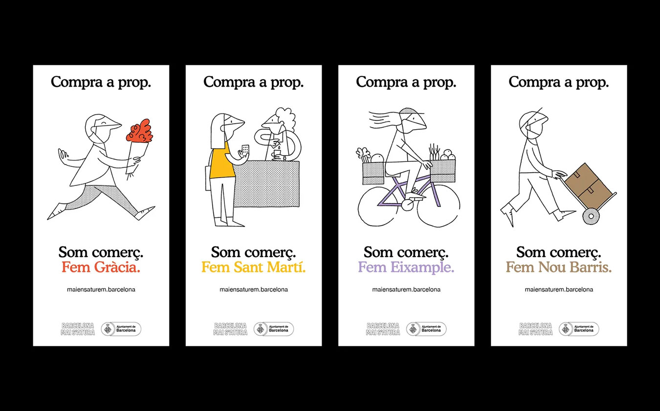
Image: «Compra a Prop» campaign by Barcelona City Council
6. Monochrome design
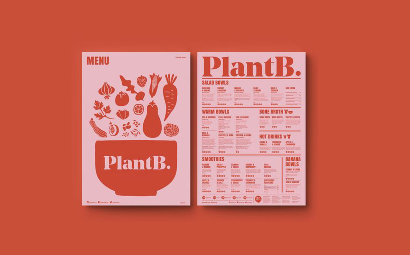
This is a technique that uses a single colour as a base, combined with another tone from the same colour range. It is a very interesting option because it unifies the image and gives it a lot of personality, especially in cases where we have many elements.
It is widely used in photography and video, but also in graphic pieces. Using a single colour range helps the brain unify the information and makes it easier for us to order the elements. With such simple, elegant colouring, it also helps keep attention from drifting away from the content, so we perceive the message more clearly.
7. Geometric shapes
Creating pieces with geometric shapes gives us endless possibilities. We can create dynamic, fun-looking compositions, series of sober and elegant patterns…
They are very useful for creating dynamic brand identities, as they help us build variable corporate patterns, and they are also a brilliant technique for constructing typefaces and typographic logos. In fact, our own logo was created this way, from circles and lines joined together!
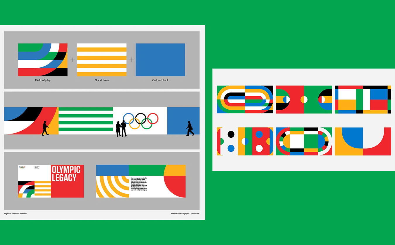
Image: Part of the brand manual for the new Olympic Games identity
8. Minimalism
This consists of reducing everything to the essentials, of letting go of any elements that are not necessary.
Many brands have redesigned their logos in this style, cutting back on excess detail and simplifying their colour palettes to one or two tones.
One reason for this trend is the rise of the online world: simplifying the brand helps make it more recognisable and legible at any size, and easier to reproduce on screens.
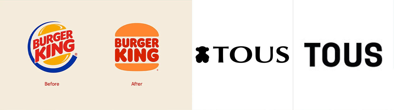
Image: Logo redesigns for Burger King and Tous
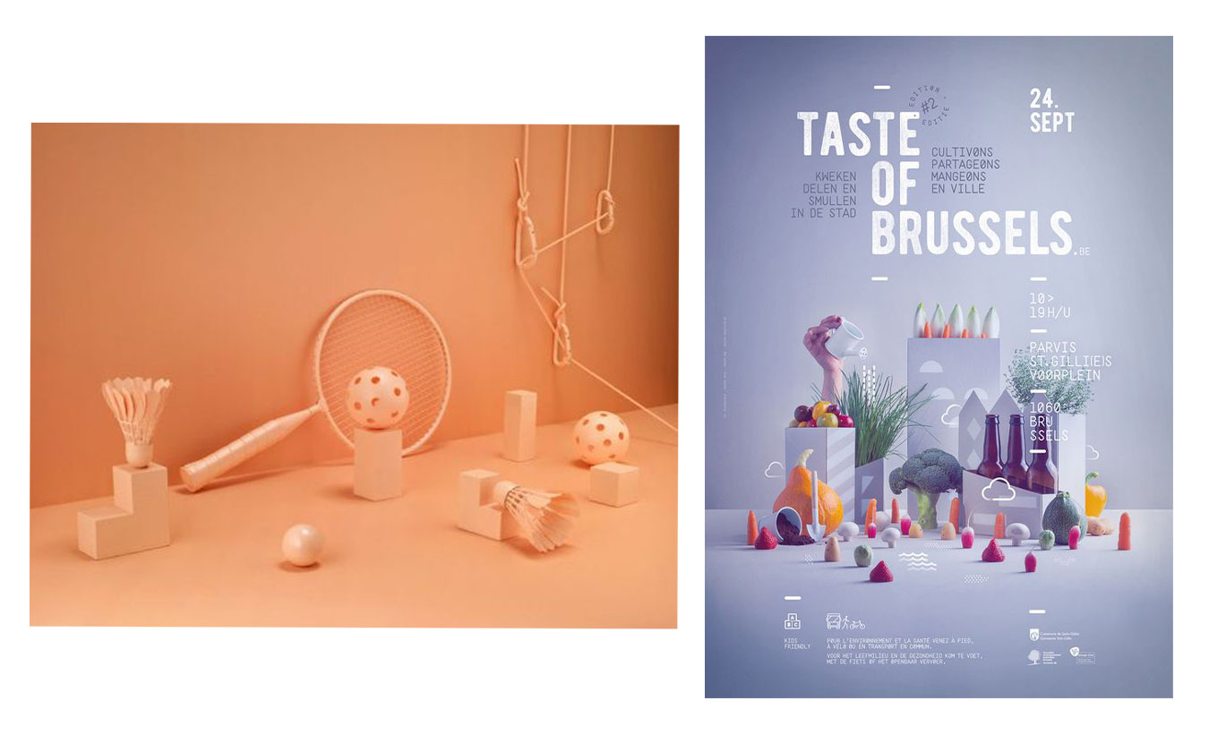
9. 2D and 3D illustration
Combining 2D/3D shapes with flat elements (such as typography and geometric shapes) helps us create very powerful compositions with perspective, bringing products to life and giving the image more detail and depth.
They can range from the abstract to a completely realistic aesthetic. Advances in software technology have hugely democratised this style.
10. Memes
Memes have fully arrived as a way for society to communicate, and many brands are making the most of them to connect with their users in a very informal, empathetic way. That said, we must be very careful when using them, as they are not right for every brand: we need to be clear that our tone of communication allows for them and not overuse them just because they are viral, but do so in a reasoned and spontaneous way.
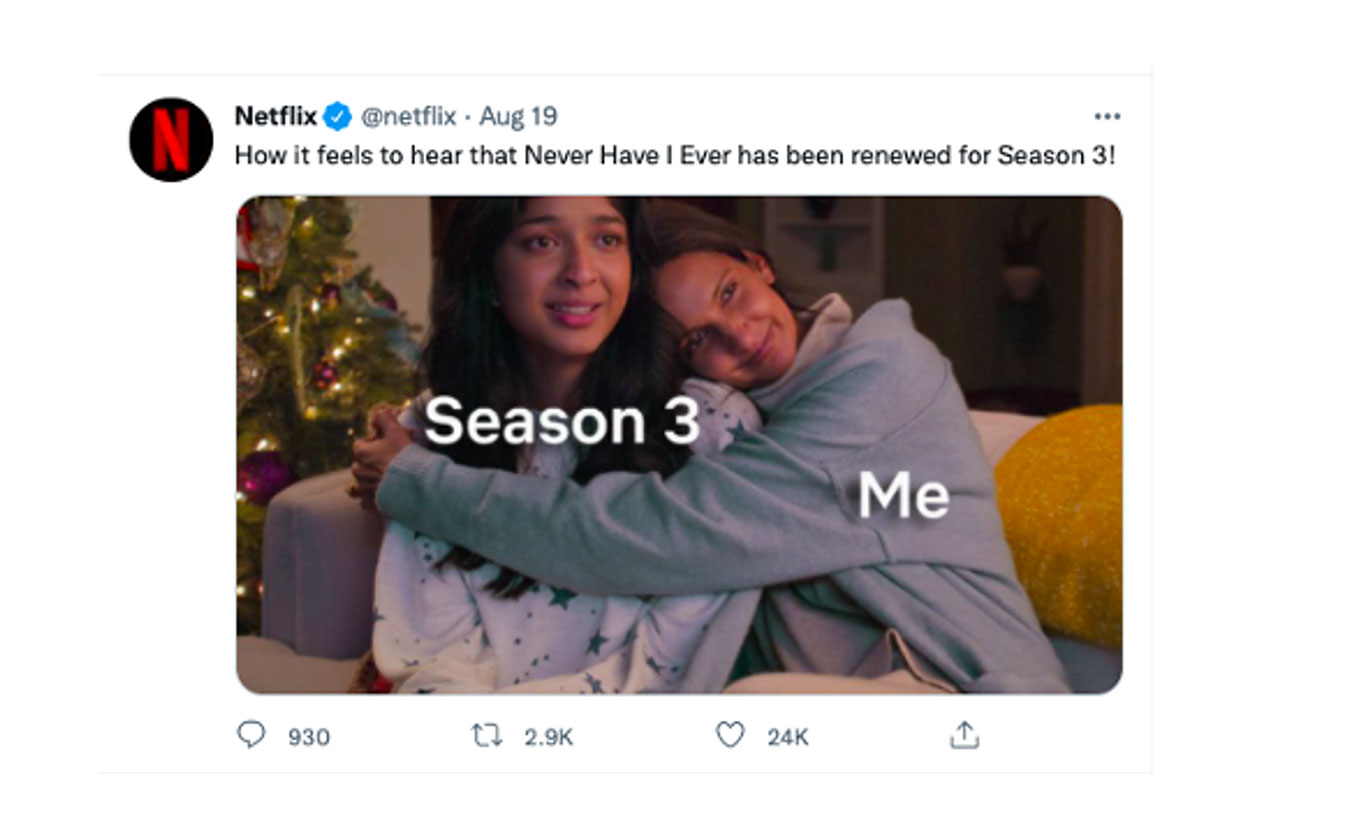
Image: Example of a meme used by Netflix.
Some of these trends may disappear soon while others will emerge to take their place, but we need to stay up to date and be flexible so that, as brands, we can respond thoughtfully and quickly to changes in culture and society.
At acrōnim, we will help your brand stay up to date so you never lose the connection with your audience.