For a long time, sans serif typefaces have been the stars of digital design. Clean, simple and easy to read, they have become the go-to choice for brands, websites and apps.
But trends change. And in 2026, serif letterforms are gaining ground again.
Modern serif typography combines the elegance of traditional letterforms with the tools of contemporary design. The result is more expressive compositions, full of personality and capable of setting a brand apart.
This revival does not mean going back to doing things the way they were done before. Classic fonts in design are being reinterpreted to fit today's visual identities, websites, social media and other digital formats.
Why serif typography is returning to modern design
One of the main reasons is the need to stand out. In recent years, many brands have opted for very similar sans serif typefaces. The minimalist aesthetic has worked very well, but it has also led to a certain uniformity. Against this backdrop, bringing back a typeface with more character can be a simple way to get noticed.
Serifs convey a different feeling. They can express elegance, tradition, trust or sophistication. It all depends on the type family, the weight, the proportions and, above all, how it is used.
This explains why they are appearing in sectors that once seemed more closely tied to sans serifs. Technology, fashion, food, cosmetics and architecture are now incorporating serifs into their visual identities.
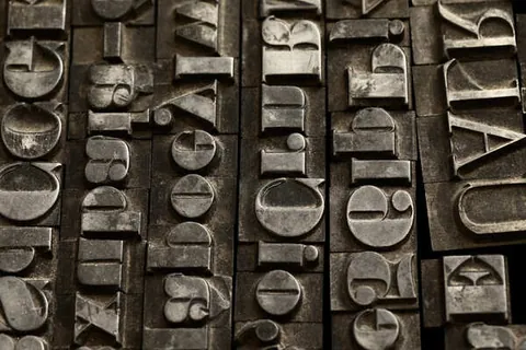
There is also an emotional dimension. Serifs have a direct link to the world of publishing and print. They remind us of books, magazines and newspaper mastheads. In a digital environment dominated by content that flashes past, this reference can bring a calmer, more considered feel.
Typography trends in 2026 are heading precisely in this direction: recovering familiar graphic resources and giving them a more contemporary reading. It is not about using an old font for its own sake. It is about harnessing its character and combining it with a contemporary aesthetic.
How to combine serif typefaces with contemporary styles
Using a serif does not mean building a classic design from start to finish. In fact, one of the options that works best is to combine it with more modern elements.
Type pairings are especially useful for creating hierarchy. A serif can work in headlines, while a more neutral sans serif can take care of body text, menus or buttons. The contrast helps to differentiate functions.
Brings personality, warmth and an editorial touch.
Keeps reading clean in menus, buttons and body text.
For example, a serif with strong forms can give a headline personality. Alongside it, a simple sans serif keeps the text legible and brings balance. It is an easy combination to apply and a very versatile one.
You can also play with different weights from the same family. A bold serif can make a headline stand out, while a lighter version can be used for subheadings or short phrases.
Another resource is size. A very large serif headline can become a graphic element in its own right. There is no need to add too many elements. White space, a good composition and a well-chosen image can be enough.
In any case, there is no single formula. The typography has to respond to the character of the project. A fashion brand does not need the same serif as a cultural magazine or an architecture studio.
Legibility also needs to be considered. A typeface can be very attractive in a headline and perform poorly in a long text. That is why it is important to test different sizes and weights before making a decision.
Inspiring examples of classic typography in digital projects
Publishing is one of the fields where the serif has held its ground most strongly. Editorial design with serifs remains a common resource in magazines, cultural publications and digital projects looking for a more sophisticated aesthetic.
In these cases, typography can take centre stage. A large headline, a composition with plenty of white space and a carefully chosen photograph can create a very powerful visual identity without the need for many additional resources. But this trend also works on corporate websites.
A brand can use a serif in its main headline and combine it with a simple interface. The result can be elegant without looking dated.
It can work in e-commerce too. Especially in sectors such as fashion, interiors, beauty or food. A serif can help convey a more refined perception of the product.
A good example is today's type families, which draw on classic references but are designed for screens. Google Fonts, for instance, offers serif options such as Lora, Cormorant Garamond and Libre Baskerville, which let you experiment with different styles and uses.
Adobe Fonts also has a wide selection of serif typefaces, from more traditional options to contemporary proposals.
The key lies in how it is used. The same font can look dated or completely current depending on the other elements around it.
That is why the return of serifs is not just an aesthetic matter. It shows how design recovers resources from the past and adapts them to new contexts.
In an increasingly saturated visual environment, standing out remains one of the main goals of design.
Modern serif typography has a place in today's design because it brings something that is often hard to find: personality.
At acrōnim we give your brand personality, through typography too.